Let's face it. Symbols are EVERYWHERE. We take them in through all our sensorial abilities. We are consistently receiving the information that is attached to symbols whether consciously or not. In this age of consumerism, logos are symbols that have become ubiquitous with identity. A company logo can have complex meaning, or no meaning at all, depending on the intention when it was created.
When done well, logos, taglines, and other images people use to convey themselves and/or their products aren't just for selling stuff. The importance of these symbols goes so much deeper. They convey emotions, quality, intent, connection, and so much more. That's definitely the case for KS Coffee.
The KS Coffee logo is constantly evolving. Some would say that is a bad business move because customers crave consistency. While there may be some truth in that, I think it's also true that people can appreciate change executed with intention, and maybe you even enjoy watching how the KS Coffee imagery continues to get tweaked little by little over time. It feels more organic this way, and it feels right that that's how this company is meant to grow.
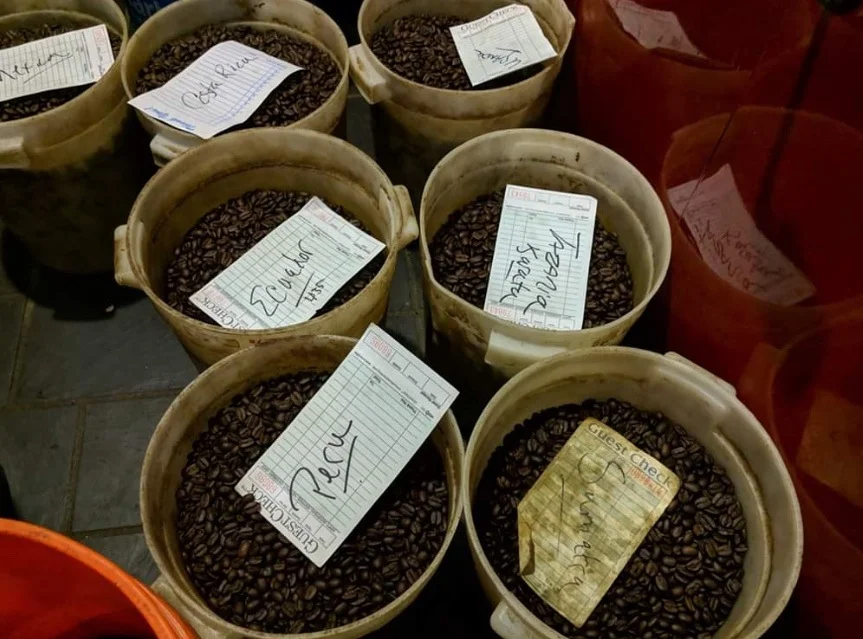
It's a small thing, but having this symbol definition information available to the public is a piece of the transparency puzzle in coffee. From blend composition, to product pricing structure, to how much our farmers are getting paid, there are no secrets here.
We in specialty coffee preach transparency, and it often comes off in a pretentious way, or is only used to show a particular part of the coffee story that creates an emotional pull and so is often used as a marketing strategy. I have a real problem with this. While it is very important to tell the stories of the people on the ground at origin to gain a better understanding, appreciation, and celebrate the level of skill, effort, and care that goes into our products, it is never okay to use their story and photos in an exploitative way, or in a way that misrepresents them as a coffee professional or person. These stories we share are also symbols. By sharing information about each other, we are creating symbolism and generating meaning behind the coffee in your cup, so it is something to be treated graciously, delicately, and with the input of those involved.
Perhaps you've noticed the most recent logo changes. I'm kind of in transition, so there are currently two logos. :D One is the square stamp style that is transitioning out. The square stamp is near and dear to me. I write a lot of letters and cards (though not as frequent as I once did, or as frequent as I would like to), and there is something really special about writing and receiving letters. Personally, I get immense satisfaction in placing a stamp on an envelope destined for someone I care about. Perhaps there is some selfishness and self-validation there, but mostly, I get really happy to think that the recipient is going to know I am sending them love. For me, a letter is love. Therefore, every time I place a stamp on a special note to someone, I feel love. Originally, the square KS Coffee stamp logo had hand-torn edges, my way of giving it that stamp-like appearance. The black square border within was a digitized version of Japanese brushwork, which reminded me of my Japanese penpal as a teenager, and the Japanese ink brushwork I enjoy. In my mind, it conveyed a sense of quality. Those elements have fallen away, mostly because hand tearing paper every time I needed to label anything became a lot of time spent. The square logo evolved into a less amateur look as I started using graphic design programs to create label artwork, brought all my printing and cutting in-house, and worked the lines and cutting to be more minimalist and less edgy. The basic elements of the bean, leaf and tri-colored lines remained, and still do in the new round logo.
The round logo came about out of necessity at first. Social media sites were all utilizing round profile icon spaces, which I think is a weird and lame way to channel everyone into having uniform looking logos. In any case, I was trying to fit a square peg in a round hole. Hesitantly, I converted to a round logo, but honestly, I've fallen in love with it. The circle feels more balanced for me, less harsh, and more refined. I don't get caught up in any corners and edges or boxed in/out by the bold black border. It feels more welcoming than I expected it would, kind of like a rabbit hole to dive into. I knew it was important to keep my basic elements, the bean, leaf and theme colors.
The fundamentals behind the KS Coffee theme colors are:
RED, representing LIFE, VITALITY, and CONNECTION. The color of the cherry fruit that contains the coffee seed. The color that runs through all of humanity.
ORANGE, representing HEALING, WARMTH, and SERVICE. The color of the flame.
GREEN, representing LAND, SUSTENANCE, and SUSTAINABILITY. The color of the coffee leaf.
BLACK, representing STRENGTH, FOCUS, and SOLITUDE. This color is an acknowledgment of where we are, where we’ve come from, the challenges we’ve overcome, and the consistent hope of stepping out of the darkness, and into the light.
I hope this gives you pause next time you’re walking down the street, or head into a shop, to take in what information is being served to you. Is it what you need and does it bring you joy? Is the message being conveyed in an invasive or welcoming way? Is it exploitative or informational? These answers are often not forthright, but it seems healthy to be asking the question.